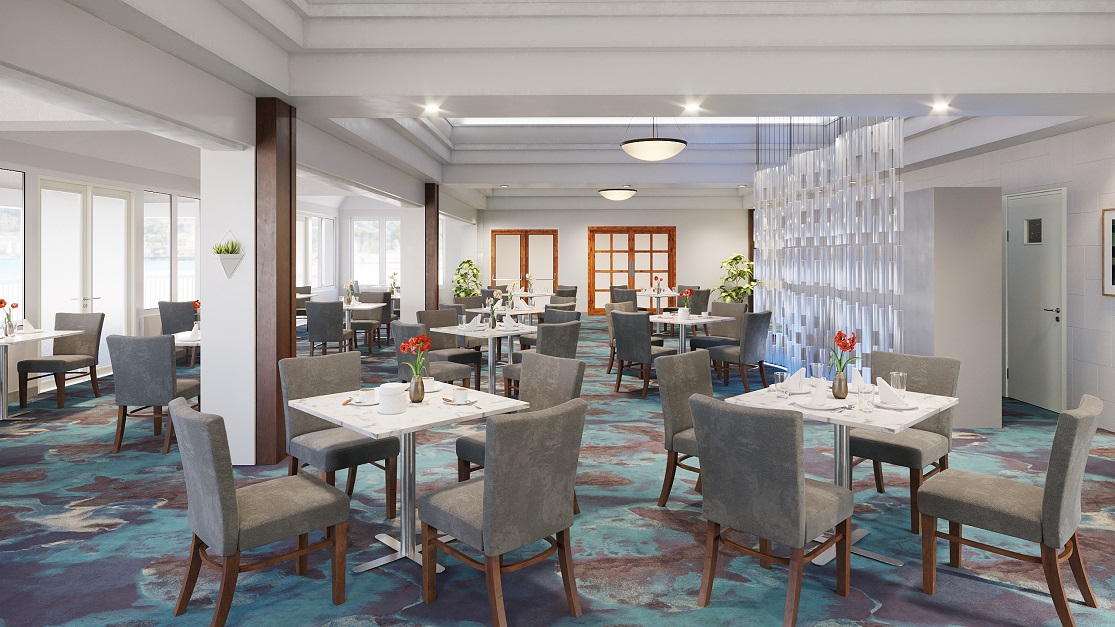
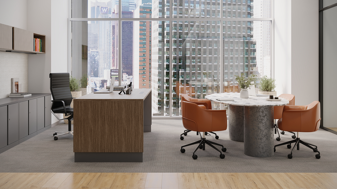
High Quality Renders: Why “Good Enough” Visualization Is Costing Brands Business
“Good enough” is one of those phrases that sounds sensible in the moment and quietly causes problems later, especially in contract furniture, where standing out is already hard, and buyers are looking at more options than they can realistically absorb. When budgets are tight and timelines are short, it’s easy to default to what’s already in place, use the visuals you can generate quickly, and tell yourself that as long as everything is accurate and defensible, it’s probably fine.
For marketing teams at contract furniture manufacturers, this shows up constantly. The visuals technically work. The products are shown correctly. Nothing is wrong on paper. But over time, everything starts to feel a little interchangeable. Websites begin to look similar. Presentations follow the same patterns. RFP responses start to blur together. From the buyer’s point of view, very little feels distinct, even when the products themselves actually are.
That sameness is rarely intentional. It’s usually the result of making reasonable decisions under real constraints. Templates help teams move faster. Default views save time. Internal tools bring consistency across large catalogs. None of that is bad on its own. The problem is that when everything looks acceptable, nothing really stands out, and in competitive environments, blending in isn’t neutral. It works against you.

Most buyers aren’t sitting down, excited to study furniture visuals in detail. They’re scanning manufacturer websites between meetings, sitting through back-to-back presentations, and comparing similar solutions across multiple brands, all while trying to make decisions that affect people, budgets, workplace culture, and long-term brand perception. When visuals require effort to decode, engagement drops fast. If a buyer has to mentally translate what they’re seeing into how a space might function, how people might move through it, or how it might feel to work there day after day, that’s work, and when the work goes up, attention usually drops.
This is where “good enough” quietly falls apart. Not because it’s wrong, but because it asks too much of the viewer at exactly the point when clarity matters most.
Furniture decisions aren’t small decisions, and buyers know that. These choices affect how people work, how spaces feel, and how a brand shows up every day. They also have to be explained and defended internally, often to leadership, finance, facilities, and end users, all of whom care about different things. When buyers can’t clearly picture the outcome, hesitation creeps in. They start leaning toward what feels familiar, what’s easier to explain, or what feels safer, even if it’s not the most interesting or differentiated option.
That’s where professional visualization actually earns its keep, and it’s not because things look nicer. What it really changes is how hard a buyer has to work to understand and stand behind an idea. Clear, realistic visuals make it easier to grasp how a product will be used, how it fits into a space, how people move through it, and how it supports the work happening there, without asking the viewer to piece it all together in their head.
There’s a big difference between asking someone to imagine an outcome and letting them recognize it. Imagination takes effort and introduces doubt. Recognition doesn’t. When buyers can immediately see what’s being proposed, they’re more comfortable talking about it, more confident explaining it internally, and more willing to put their name behind it. That’s usually when reactions shift from polite interest to things like, “I can see how this would work,” or “This actually makes sense for us,” which is less about being impressed and more about uncertainty fading away.
Marketing teams tend to feel the downside of “good enough” earlier than anyone else. It shows up as weaker engagement on key pages, presentations that don’t quite land, and the sense that nothing really sticks once buyers leave the room. Over time, sales ends up carrying more of the load, having to explain and re-explain the same ideas because the visuals never fully did that job on their own.
For marketers at contract furniture manufacturers, this matters because so much of the buying journey happens before a formal process ever begins. Long before an RFP shows up, buyers have already formed impressions based on a website, a presentation, or a handful of early conversations. If those moments lack clarity or distinction, buyers arrive later already leaning on specs, pricing, and familiarity instead of preference.
Used intentionally, visualization gives marketing a way to shape those early impressions. It helps create moments that are easier to remember, easier to talk about internally, and easier for sales to build on instead of starting from scratch every time. It’s not about using premium visuals everywhere, but about knowing when clarity, memorability, and confidence matter more than speed and efficiency.
The more useful question isn’t whether something is technically “good enough,” but whether it’s actually helping your brand get chosen. In competitive contract furniture markets, “good enough” rarely wins. Most of the time, it just avoids standing out, and in a category where so much already looks acceptable, that’s often the biggest risk of all.
If you’re responsible for how your brand shows up before an RFP ever lands, this is probably a familiar tension. Knowing when “good enough” is fine and when it’s quietly costing you attention is not always obvious. We spend a lot of time working with marketing teams across the contract furniture industry on exactly that question, and we’re always happy to share what we see working and where clearer visualization high quality renders tends to make the biggest difference.