
Healthcare Design Trends 2026 – Beyond the Patient: What HCD 2026 Told Us About Care

Our visualization team spent time at the Healthcare Design Conference + Expo this year, and one of the things they kept coming back to afterward was how much of the conversation seemed to fall into three areas: the patient, the family or support network around them, and the caregivers delivering care.
There were plenty of familiar themes across the show. Healthcare interiors are getting warmer. Hospitality influences continue to show up. There was lots of discussion around flexibility, acoustics, technology, accessibility and biophilic design.
The conversation wasn’t really about making healthcare spaces look nicer. It was about making them work better for the different people using them, often in very different ways.
That is useful for manufacturers and dealers too. If these are the things healthcare clients are thinking about, it helps to understand not just the trend itself, but what it means for the way you present a product or solution.
For patients, comfort is getting more specific
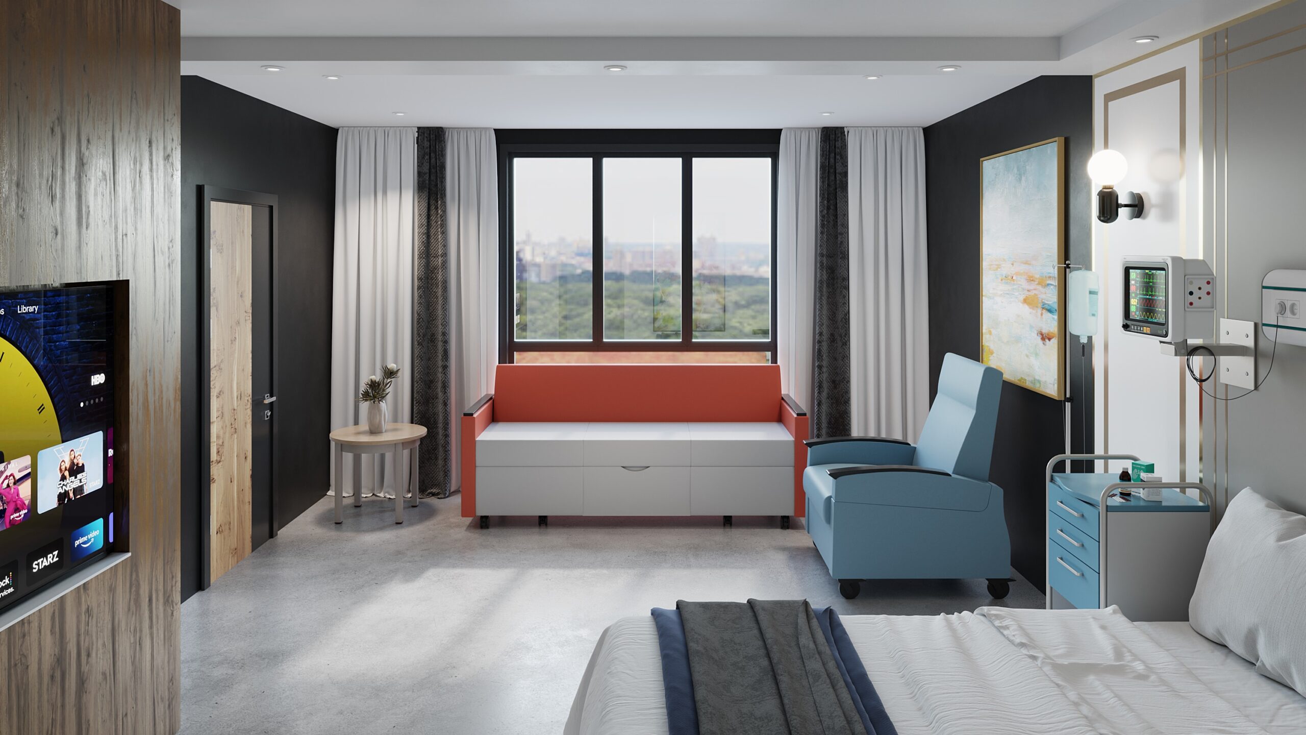
One thing our team noticed was how often the conversation came back to the patient’s actual experience of the space. Not just whether the room looked good, but what the patient sees from the bed, what they can control, and whether the environment helps them feel a little more comfortable. One example from Healthcare Design’s 2026 Design Showcase was the reminder that a lot of time can go into designing the patient headwall, even though the patient lying in bed may spend much more time looking at the footwall and ceiling.
It is easy to design a room from the doorway or from the viewpoint that makes the rendering look best. It is different to think about what the person in the bed actually sees all day.
The same applies to things like lighting, materials, color and furniture. Warmer woods, softer textures and deeper colors can make a clinical space feel less stark, but the real question is whether the room feels more comfortable and less stressful to the person spending time there.
Another thing that came up a lot was giving patients a little more control over their environment. Being able to adjust lighting, temperature or other elements of the immediate environment may seem small, but when so much else is outside the patient’s control, those details matter.
We also kept coming back to how people find their way through these spaces. In a healthcare setting, people are often navigating while they are already stressed, distracted or worried. The best spaces are using color, lighting, landmarks and layout to make that process more intuitive rather than relying only on signage.
What does that mean when you’re showing a product?
For manufacturers and dealers, the takeaway is really about being a little more thoughtful about context. If a chair is meant to help a patient room feel warmer and more comfortable, it helps to show it in that kind of environment rather than as an isolated product. If the product supports technology, movement or patient control, those details are worth making visible too.
The same is true of viewpoint. A room may look great from the doorway, but that is not necessarily how the patient experiences it. In some cases, showing the space from the bed or from another user’s perspective can make the benefit much easier to understand.
The goal is simply to help the client connect the product to the experience they are already trying to create.
Families and support networks were another big part of the conversation. That makes sense when you think about how much time people can spend in these spaces. A family member may be waiting for hours, sleeping beside a patient, taking a work call, charging a phone, storing bags or simply looking for somewhere a little quieter.
That puts a different lens on things like waiting areas and patient-room furniture. “Comfortable seating” has to do a lot more when someone may be using it for several hours rather than a few minutes.
Healthcare Design’s jurors highlighted patient rooms that gave families more flexibility through practical choices like movable furniture, places to eat or work and sleeper seating that made better use of the room. We also liked the idea of designing for the long wait, not just the average one, because it reflects how these spaces are actually used.
A waiting area that feels perfectly adequate for a short appointment can be a very different experience several hours later. Families may want to sit together, find some privacy, accommodate children or mobility devices, or get a bit of work done while they wait.
That is where flexibility starts to mean something more useful than simply being able to move the furniture around. It is really about whether the space can support the different ways people may need to use it over the course of a day.
Showing how the product actually works
This is also where the way you present the furniture can make a difference. Some products are easy to understand from a single image, but others really need a little more context. A sleeper chair that converts, modular seating that can be arranged several ways, or a product designed to support both privacy and group use all have more to say than one static view can usually show.
Animation can be useful for exactly that reason. Rather than describing how a product moves or changes configuration, you can simply let the client see it happen. VR gives them something different again: the ability to look around the space themselves, get a better feel for scale and understand how the furniture relates to everything around it.
The point isn’t to make the presentation more elaborate. It is really just about choosing the format that makes the important part of the product easiest to understand.
For caregivers, the workday matters too
Caregiver wellbeing was another area that seemed to be getting more attention this year. Staff respite spaces were noticeably more considered, and it was good to see them treated as spaces worth designing well rather than as whatever room happened to be available.
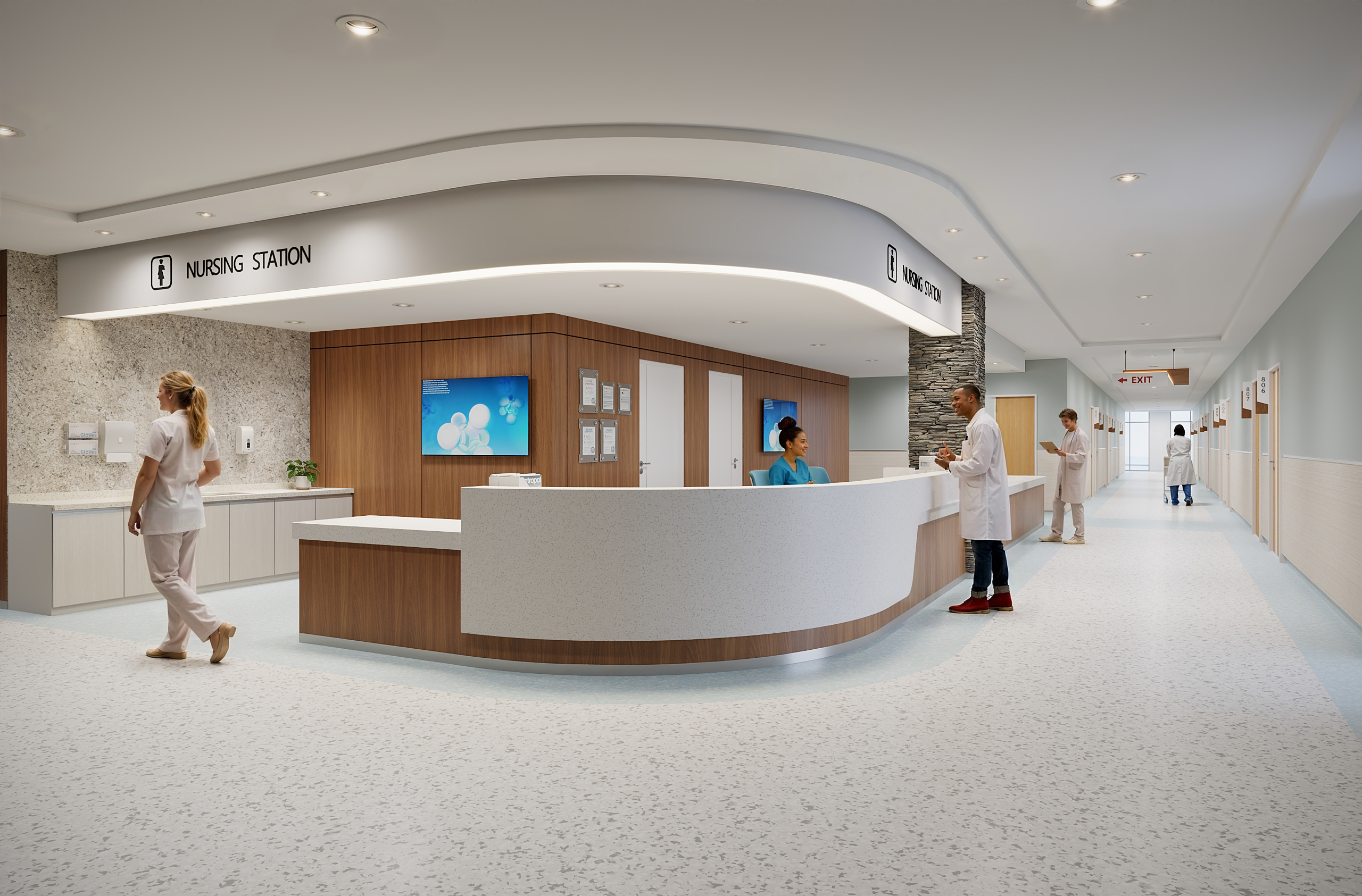
What was more interesting, though, was the broader conversation about the places where caregivers spend most of their day. A good respite room matters, but staff are working in patient rooms, at work points, in corridors and around equipment for hours at a time. The layout, furniture, access to what they need and ability to move through the space all affect that experience.
That seems to be pushing the conversation beyond the traditional break room. Decentralized work points, places to pause closer to patient rooms, better ergonomics and more thoughtful everyday work environments are all part of the picture. A beautiful lounge at the other end of the building only helps so much if staff rarely have time to use it.
What this can mean for furniture teams
For manufacturers, that opens up a broader way to think about caregiver-focused products. Supporting staff doesn’t necessarily mean introducing a new lounge collection. It may be an adjustable table that makes a task easier, furniture that supports several kinds of work, a product that helps keep frequently used items close at hand, or a system that can change as the needs of the space change.
Those are also the kinds of features that can be difficult to appreciate from a product image alone.
Our visualization team works with commercial furniture every day, so we run into this fairly often. Sometimes a good rendering tells the story perfectly well. Other times, the interesting part is what the product does once someone starts using it: the table adjusts, the system changes configuration, technology becomes accessible or the room can serve a different purpose.
When that is an important part of why the product was designed the way it was, animation or an immersive experience can help the client understand it much more naturally than another still image.
A more consistent experience
One other idea seemed to connect the patient, family and caregiver conversations: the move toward a more consistent experience throughout the facility.
Healthcare Design’s jurors talked about projects where beautiful public spaces gave way to much more generic clinical areas, and contrasted them with projects where the same care and design thinking continued throughout the building. It is an interesting distinction because the experience of healthcare obviously doesn’t stop when someone leaves the lobby.
If warmth and comfort are important, you would expect to see some of that thinking continue into patient areas. If supporting families matters, it should extend beyond a single waiting room. And if caregiver wellbeing is a priority, it needs to be considered in the places where staff actually spend their working day.
What was also interesting was that the stronger projects didn’t necessarily seem to be doing more. In many cases, they had a few clear ideas and carried them through different spaces in a consistent way.
There is something useful in that for furniture manufacturers and dealers as well. Rather than always thinking about a waiting chair, patient-room product or staff solution in isolation, it may be worth looking at how the pieces contribute to the broader environment. A product can still have its own story while also feeling like part of the same healthcare experience.
Bringing it back to the client
What makes these trends useful is not knowing the language around them. It is understanding what they mean when you are sitting with a client and talking through a real project.
If patient comfort, family support or caregiver wellbeing is part of the brief, that should influence the questions you ask, the examples you bring forward and the way you show what your product can actually do.
On the next healthcare project, think about:
- Who is using this space: patients, families, caregivers or some combination of the three?
- What are they actually doing there, and for how long?
- Which part of your product supports that experience?
- Is that benefit obvious from a product image, or would it be clearer in context?
- Does the product move, change, convert or support multiple uses in a way that is worth showing?
- Would another viewpoint, animation or VR help the client understand something they might otherwise have to imagine?
At KiSP, that is often where the conversation starts.
Sometimes a sales team just needs a quick way to put real furniture into an environment and explore an idea, which is where KITS Assist can help. Sometimes the product needs a more developed visualization, several viewpoints, an animation or an immersive experience.
The format depends on the story.
What matters is understanding what the client is trying to achieve and making it easier for them to see how the product fits into that picture.
That was probably our biggest takeaway from HCD this year. The trends were interesting, but the more useful part was seeing how much thought is going into the people behind them.
Patients need spaces that help them feel more comfortable and in control. Families need room to stay and participate. Caregivers need environments that support the work they are doing all day.
If you understand those needs, it becomes much easier to have a better conversation about where your furniture fits.